This article was originally published on ArchDaily in 2014.
The triumphant critical reception of the Yokohama International Passenger Terminal was the product of inventive architectural methodology and socially conscious thinking. Designed by Foreign Office Architects (FOA) in 1995, the futuristic terminal represented an emergent typology of transportation infrastructure. Its radical, hyper-technological design explored new frontiers of architectural form and simultaneously provoked a powerful discourse on the social responsibility of large-scale projects to enrich shared urban spaces.
The architectural competition for the terminal was famously intense, and winning it required the then-wife-and-husband team of Farshid Moussavi and Alejandro Zaera-Polo to rethink the established template of terminal design. Located on an important waterfront site in Japan’s second most populous city, the high-profile commission attracted 660 entries from around the world, the country's largest international competition to date. [1] The enormous, 430 meter-long project took eight years and a budget of £150 million to complete, and required FOA to temporarily relocate their studios to Yokohama to supervise construction. The public opening of the terminal occurred in 2002, serendipitously coinciding with the final game of the World Cup being held only a few miles from the shoreline.


The striking appearance of the terminal was made possible only by tremendous advances in computer-aided design. It was conceived primarily in section, with an incredibly complex series of surfaces that gently curve and fold into a navigable, inhabitable architectural topography. Atop the observation deck, the material fabric of the floor rises and falls in wave-like oscillations to create pathways and apertures into the vast, enclosed spaces below. These changes in elevation—sometimes subtle, sometimes sharp—were the essence of the novel architectural language invented for the project.


The building is organized in three vertical levels. Atop a first-floor parking garage, a spacious middle floor contains the terminal’s administrative and operational areas, including ticketing, customs, immigration, restaurants, shopping, and waiting areas. The steel beams that span the ceiling add a weighty feeling to the space that contrasts sharply with the feel of the observation deck, which has the sensation of being made of a light, flexible, and easily malleable plane. Connecting the three levels are a series of gently sloping ramps, which the architects decided were more effective than stairs at maintaining a continuous and multi-dimensional flow of circulation.


A unique structural system made of folded steel plates and concrete girders supports the building. The strength of the materials minimizes the need for vertical supports and allows for a mostly open floor plan, while the height of the structure allows for a spectacular variety of ceiling conditions in the interior spaces. According to the architects, the structural scheme is especially adept at coping with the lateral forces of seismic movements, a necessary precondition of buildings of its size in Japan. [2]


Throughout the project, a deliberate dynamism pervades the tectonic and material languages of the building. The abundance of non-orthogonal walls, floors, and ceilings creates a controlled sense of vertigo that is accentuated by similarly off-kilter fixtures and details. The effect is magnified by material cues, such as the shifting grains of the wooden planks on the observation deck that indicate the locations of creases, and the minimalist grey metal paneling that is revealingly worn by the structures under it.


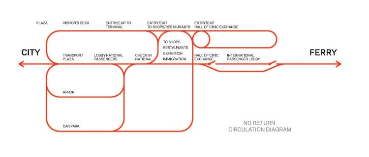
While the contours of the building occasionally betray an element of randomness, they are in fact generated by a single circulation scheme that dictates spatial organization. The circulation operates as a continuous looped diagram, directly rejecting any notion of linearity and directionality. Visitors are taken through paths that meander vertically and horizontally before arriving at any destination, and their sight lines through space are comparably tortuous and indirect. For all of the chaotic complexity of the materials and formal gestures, the simplicity of this diagram offers a sense of clarity and reveals the process from which the building emerged.

The greatest conceptual strength of the project is perhaps its sensitive relationship with the urban waterfront. With the observation deck doubling as a fully accessible public plaza, the terminal seamlessly emerges from the neighboring Yamashita and Akaranega Parks to make one uninterrupted, universally accessible urban parkscape. Its height is calculated to achieve continuity with the shore and to ensure that inland views of the waterfront remain unobstructed.
The terminal won several international awards after its completion, including the 2004 Enric Miralles Prize, and brought enormous recognition to FOA, Zaera-Polo, and Moussavi. It also completely challenged the limited role of traditional public infrastructure projects, creating a new precedent of technological innovation and urban integration that many have since tried to match.
[1] "The Birth of the Yokohama International Passenger Terminal." Osanbashi.com. Accessed 22 Sept. 2014 from http://www.osanbashi.com/en/outline/.
[2] Farshid Moussavi Architects. “Yokohama International Port Terminal: Overview.” Accessed 22 Sept. 2014 from http://www.farshidmoussavi.com/flash/index.html#/projects/465.
-
Architects: Foreign Office Architects (FOA)
- Area: 48000 m²
- Year: 2002
-
Photographs:Satoru Mishima / FOA, Flickr user twu


